MPL 3.0 — Product Design Case Study
A new visual
direction
India's biggest gaming app takes off with a fresh gamified look.
What we did
A gamified system, end to end
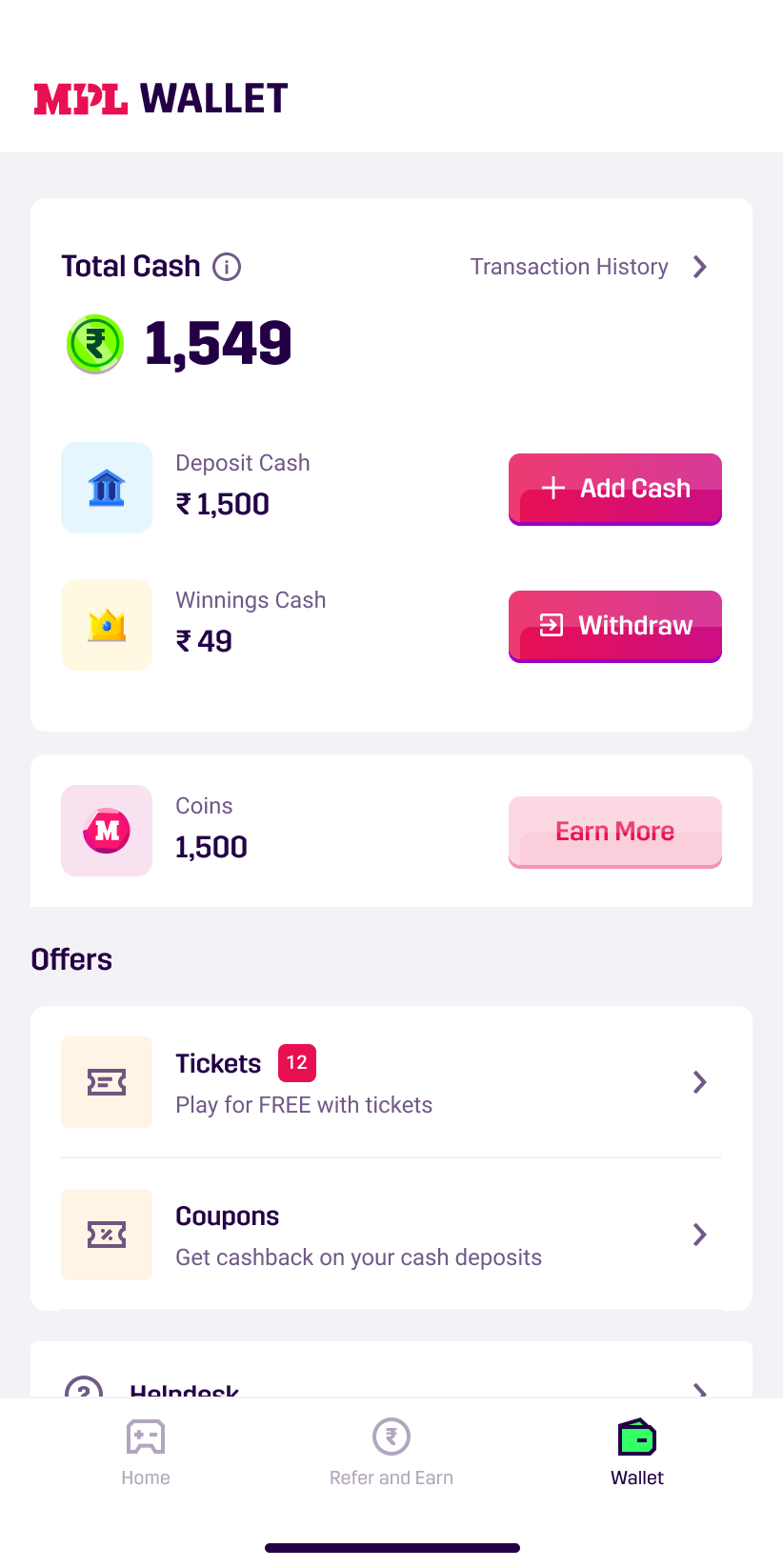
Where we started
The current MPL app experience
Very plain, minimal, boring, inconsistent & non-gamified.
The intent
Not a rebrand,
a facelift.
We didn't set out to rebrand MPL, but we couldn't resist giving it a fresh look.

The redesign in motion
See it come alive
The centerpiece
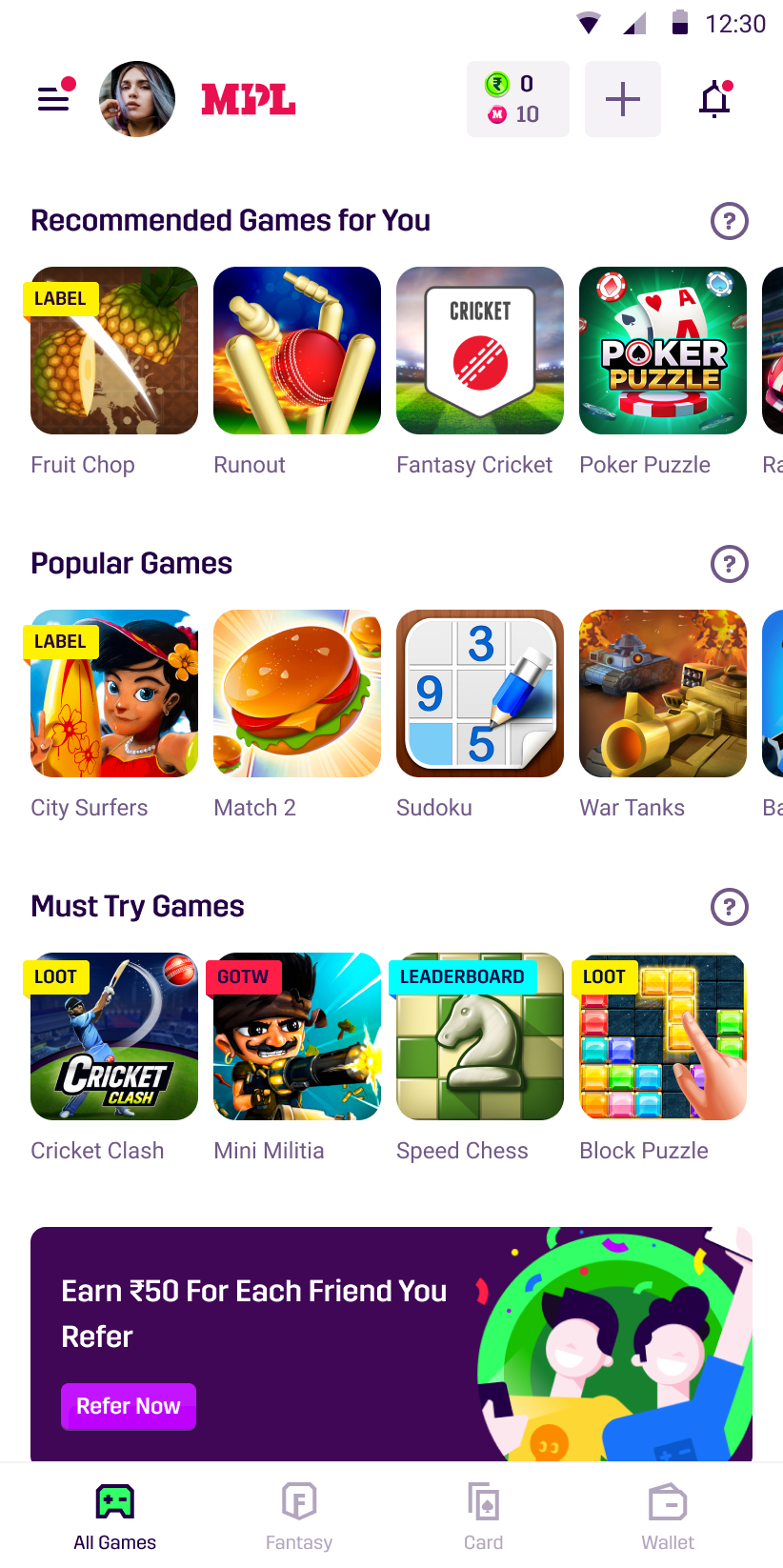
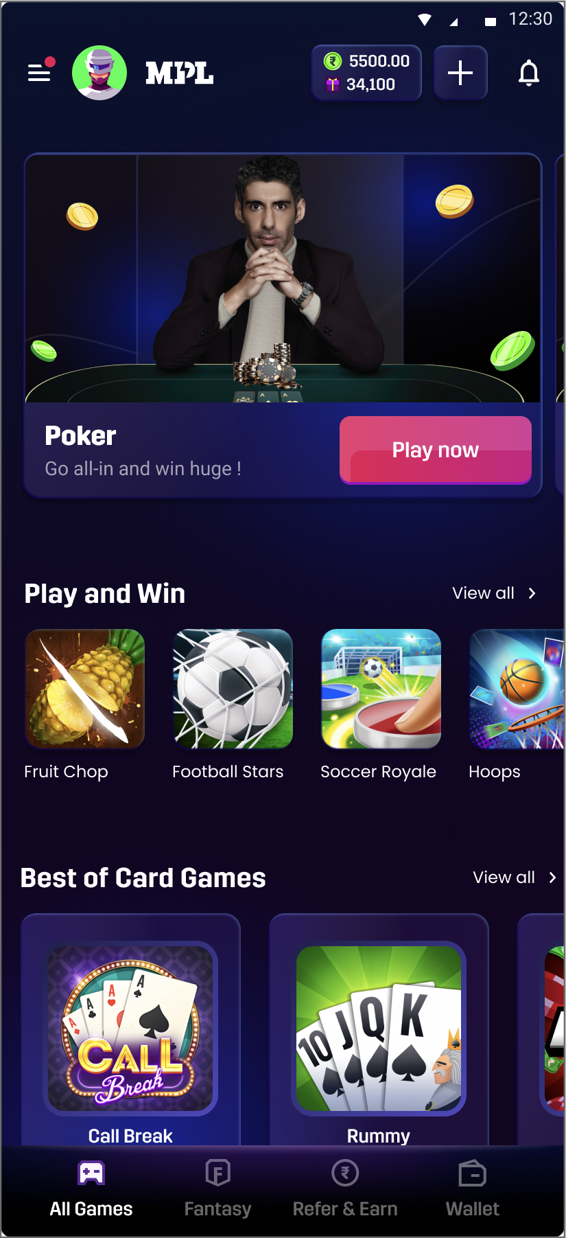
Homepage
This is what users see when they land on the homepage for the first time.

- 01
Most popular MPL game tile at the top.
- 02
Game reel to showcase other games of MPL.
- 03
Big video tile for the popular MPL format called Clan Wars.
- 04
Card game tiles with the highest revenue to capture user attention.
- 05
Game of the day tile where a new game is featured every day.
- 06
Different game category section so users can find their preferred game.
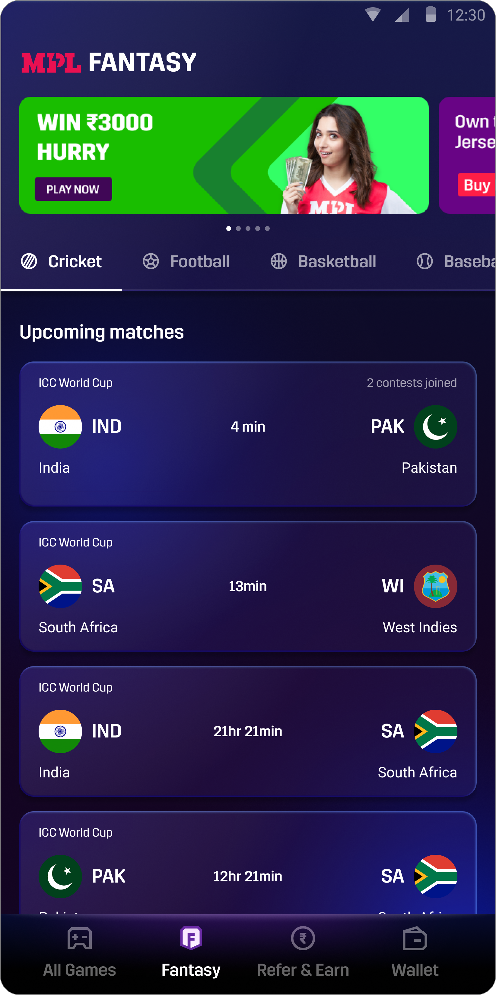
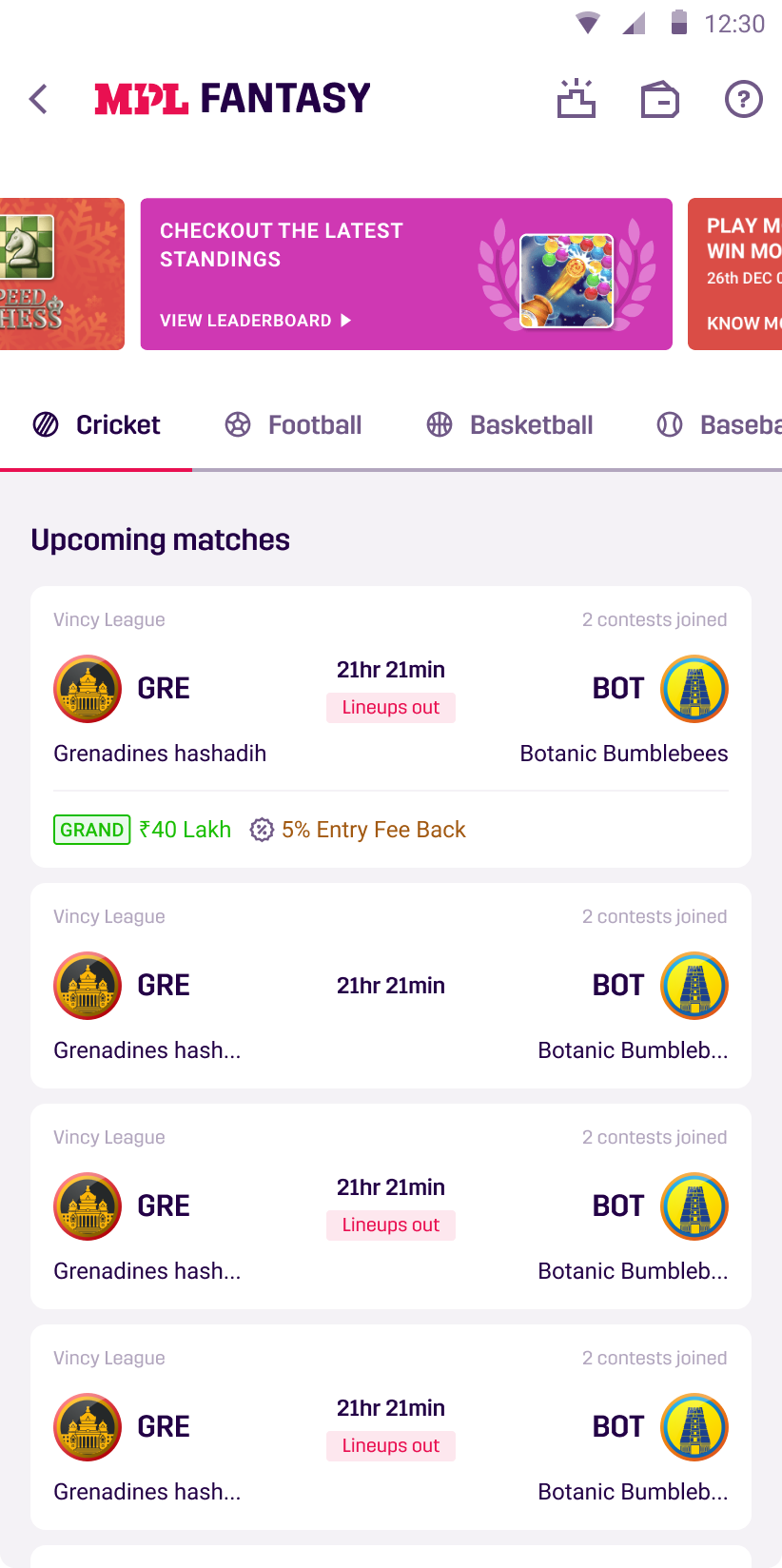
Fantasy Landing Page
Users can join any fantasy contest from here — cricket, football, basketball and more.
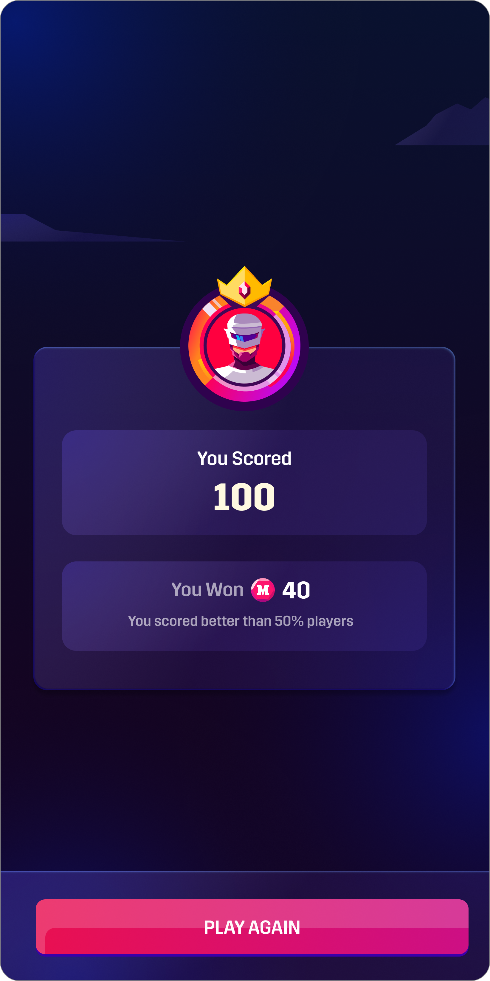
Result Screen
An updated result screen with the new visual language to give that oomph factor.
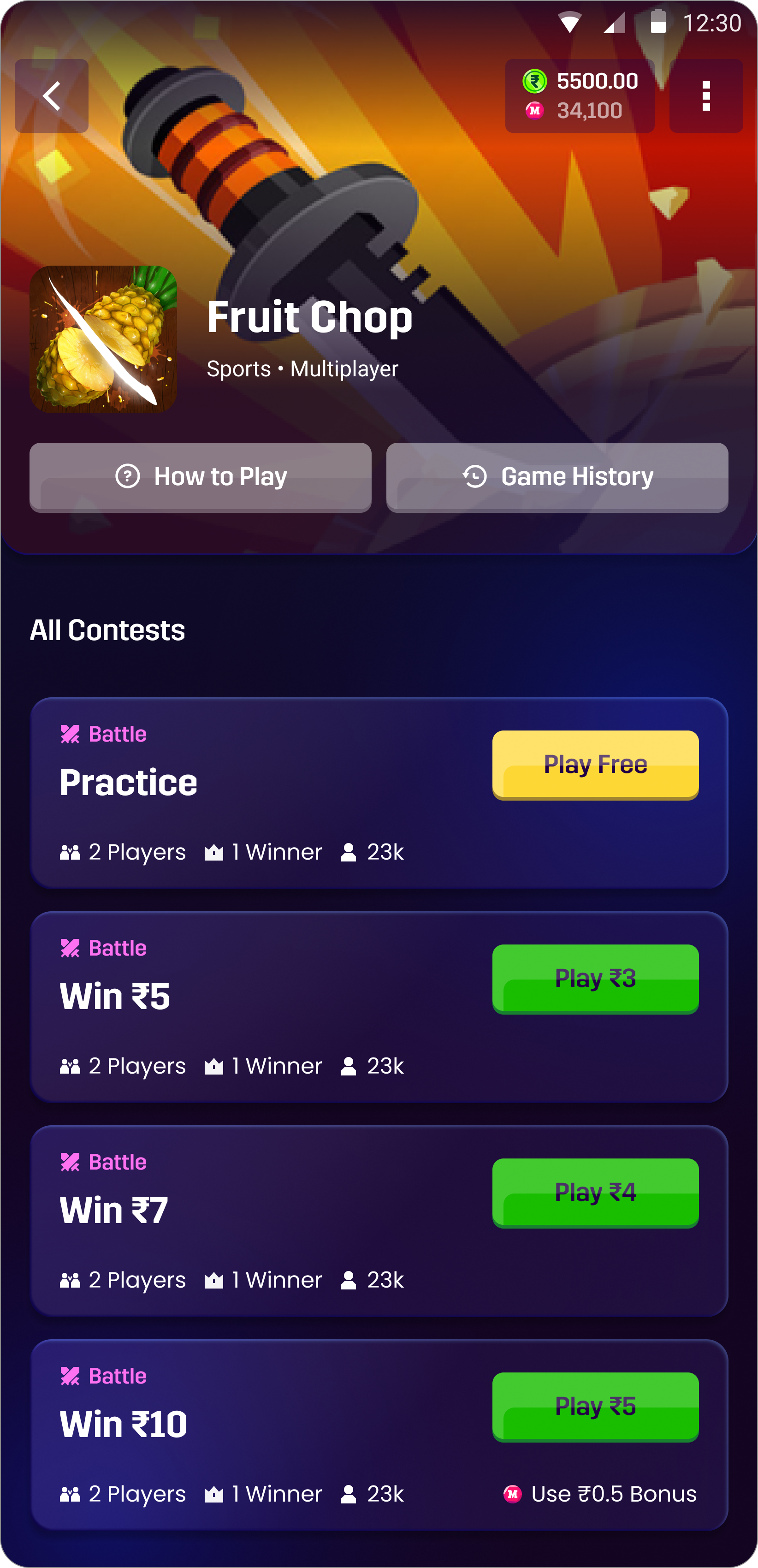
Gameview Page
Users can join their preferred game lobby by entering into this page.
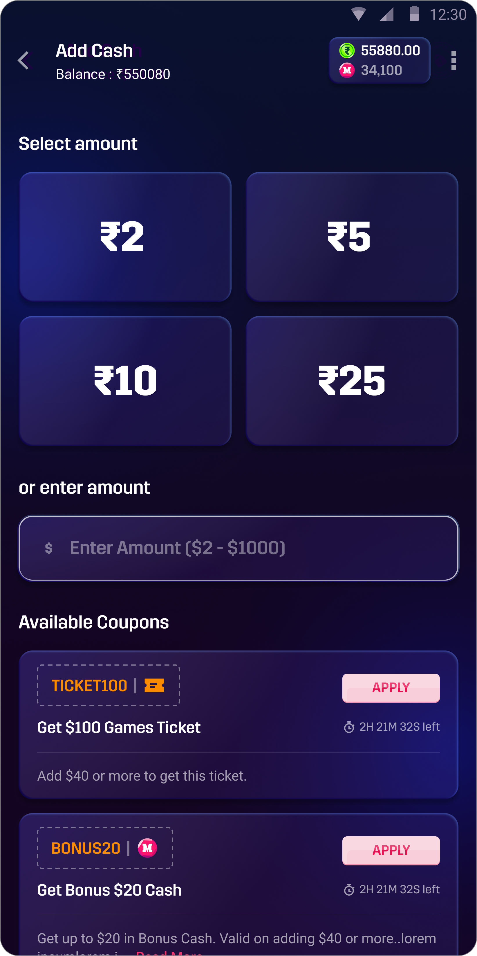
Add Money
Users can add real money to their wallet from here.
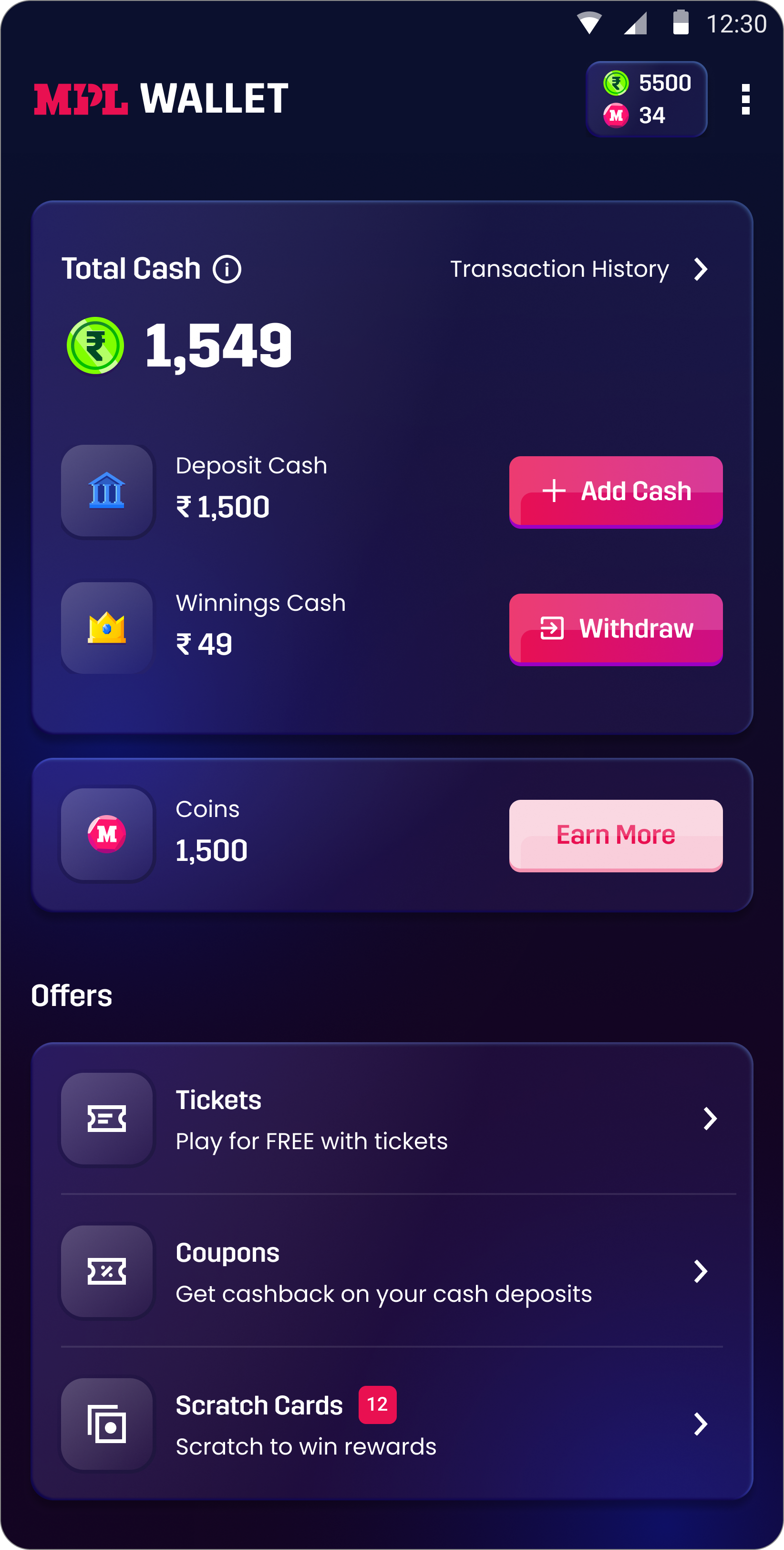
MPL Wallet
Users can check their current wallet amount, deposit cash and winnings cash — and withdraw their winnings directly from the wallet.
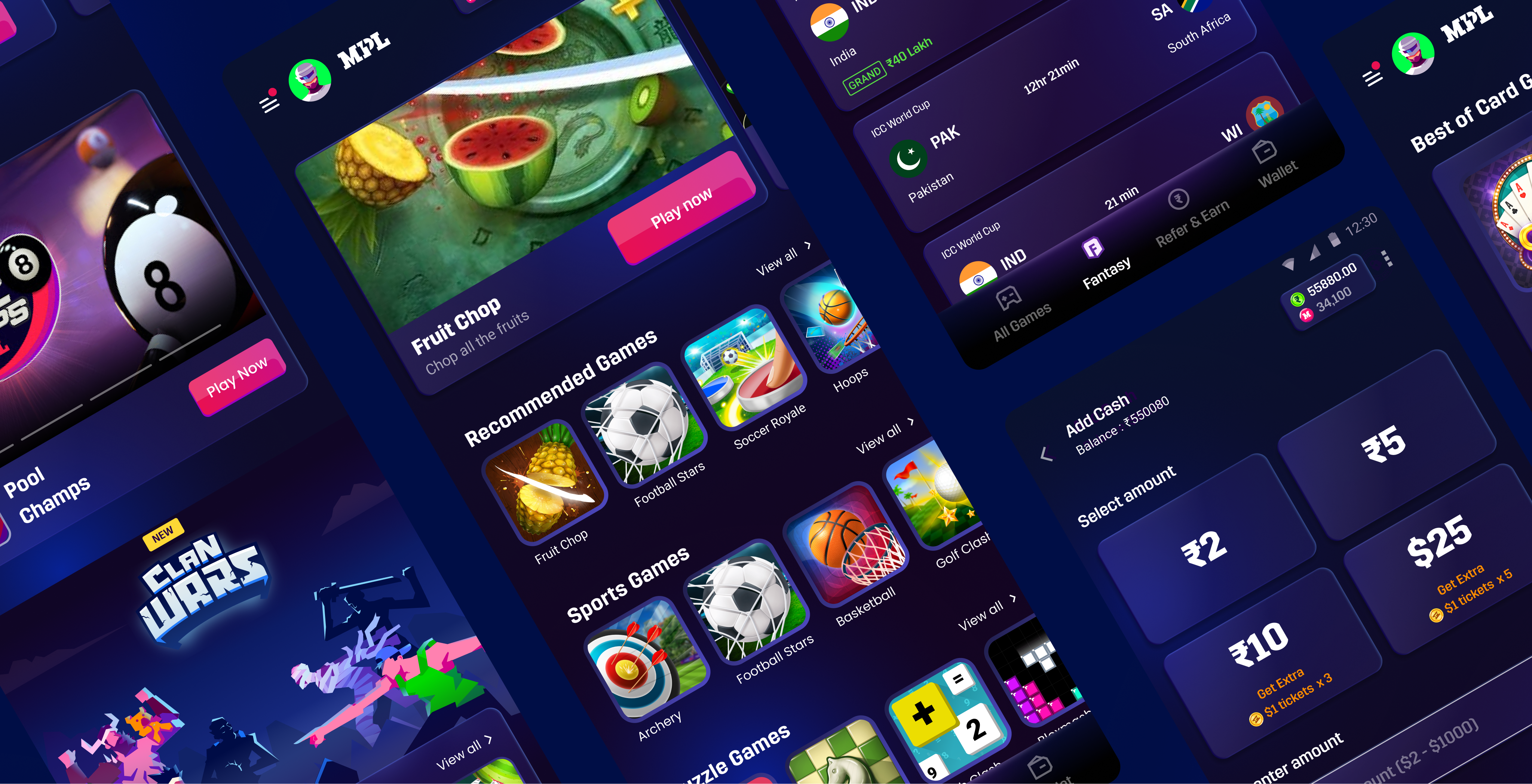
Introducing MPL 3.0
The emotions we wanted to capture
One design language
Campaign + website + app, coming together
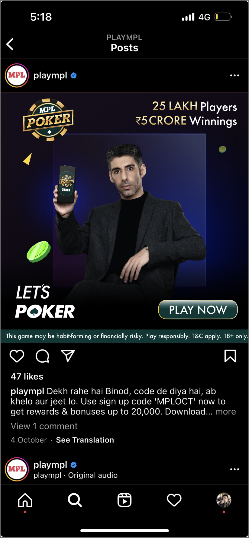
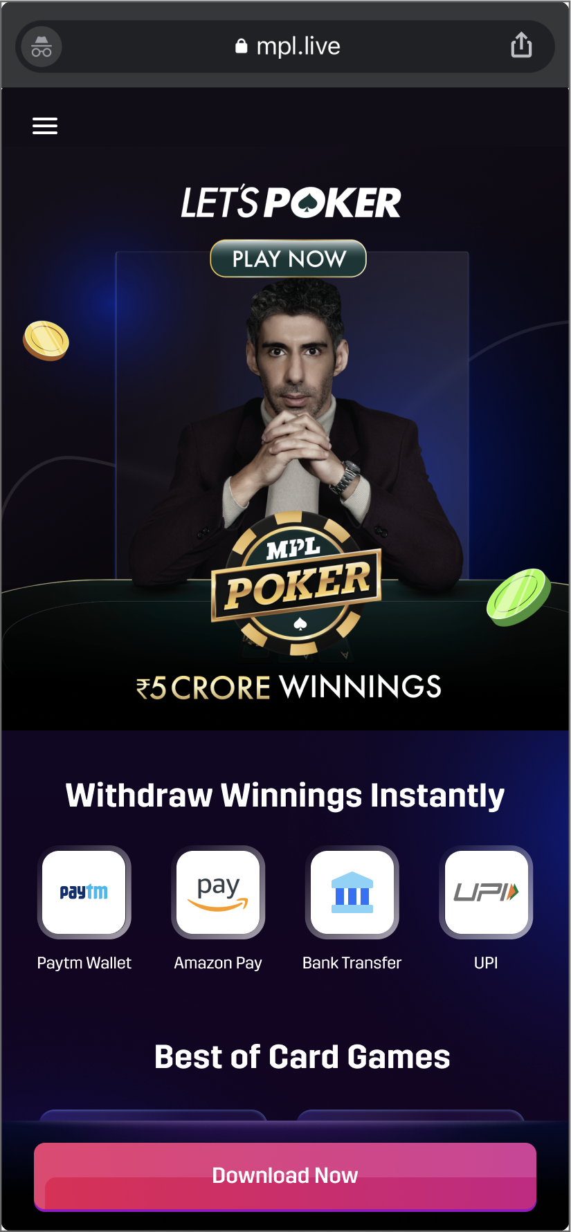
There was huge design inconsistency earlier across campaigns, website and app — which we solved with the new design language.
What's more?
A fresh set of profile pictures
Be a vampire, be a ninja, be a hero — or whatever you like.